| Prev | Next |
System Boundary Properties
The System Boundary element has a small set of properties that are mainly concerned with the appearance of the element. You can also apply other element control options such as default appearance, locking the element and applying an image to the element.
The element must be set to 'Selectable' in order for you to be able to change its properties.
Access
|
Context Menu |
Right-click on Boundary element | Properties | Properties |
|
Keyboard Shortcuts |
|
|
Other |
In the Properties window (), click on the 'Boundary' tab |
Set System Boundary Properties
Option |
Action |
See also |
|---|---|---|
|
Name |
(Optional) Type a name for the element. (This field does not appear on the 'Boundary' tab of the Properties window). |
|
|
Shape |
Click on the drop-down arrow and select from these options:
|
|
|
Style |
Click on the drop-down arrow and select from these options:
|
|
|
Horizontal Swim Lanes |
Type in the number of horizontal segments you want to divide the element into, to group the elements in the System Boundary in horizontal contexts (for example, Client, Application and Database tiers could be represented in swim lanes). The field defaults to 1. Leave it on this setting if you intend to use the custom grid. The swim lanes are equal divisions of the System Boundary - you cannot change their relative heights. |
|
|
Vertical Swim Lanes |
Type in the number of vertical segments you want to divide the element into, to group the elements in the System Boundary in vertical contexts (for example, Start, Progress and Terminate segments). The field defaults to '1'. Leave it on this setting if you intend to use the custom grid. The swim lanes are equal divisions of the System Boundary - you cannot change their relative widths. |
|
|
Instance Classifier |
(On the Properties window.) Shows the classifier for the Boundary. If one has not been specified, or you want to change it, click on the |
Select |
|
Multiplicity |
(On the Properties window.) Shows the number of instances of the element that can exist in a set; if there is no figure set or you want to change it, click on the drop-down arrow and select an appropriate value. |
 icon and locate and select the required Classifier using the 'Select Element' dialog. The
 Customize System Boundary - Orthagonal/Freeform
When you have selected one of the 'User Defined' options in the 'Shape' field, you can add way-points to the sides of the System Boundary, to drag in a direction to create a new shape. This helps you to create irregular shapes that enclose dispersed elements that cannot be captured in a simple rectangle or ellipse.
The 'Orthogonal' variant helps you to create shapes with vertical and horizontal lines, whilst the 'Freeform' variant helps you to create diagonal lines.
To set a way-point on an edge:
- Press , or on the appropriate point on the edge
To clear a way-point:
- Press Shift+click, Ctrl+click or Ctrl+Q on it
To move a way-point:
- Click on the boundary to display all way-points, position the cursor on the required way-point so that it changes to green, and then click and drag the way-point; when you move the cursor onto the border, the way-points on either side of the cursor turn green and you can click and drag that segment of the border
If you create a 'Freeform' shape and then change the 'Shape' setting to 'User Defined - Orthogonal', the system converts all diagonal lines to vertical or horizontal lines. You might then have to adjust the shape so that it has fewer lines. If you try to drag an orthogonal way-point in a diagonal direction, the horizontal and vertical lines adjust to maintain a right-angle at the cursor position.
Customize System Boundary - Custom Grid
When you select this option, you are able to draw horizontal and vertical lines within the Boundary, using the same style as you have set for the Boundary borders. Note that this option is an alternative to using swimlanes - you don't use both options together, and the swimlane options are disabled.
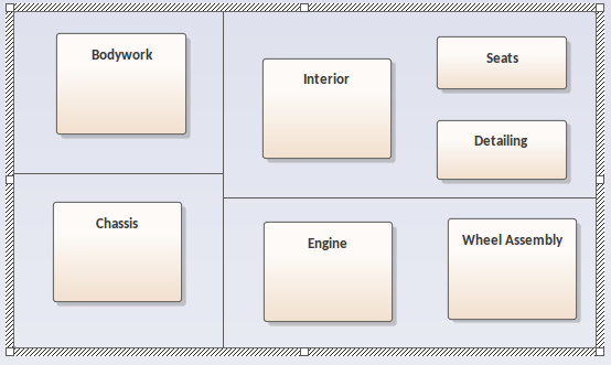
The custom lines link existing lines, so if you have a Boundary with no divisions you can draw a line between the borders of the element (as for the vertical line in the illustration), but if you have already added cells you can draw a line between the vertical or horizontal borders of a cell (as for the two horizontal lines in the illustration). This helps you to add further non-regular groupings of elements within the Boundary, to create an effect such as appears in a Business Model Canvas. Just as you can drag elements between swimlanes, you can also drag elements between custom cells.
To add custom cells to the Boundary element:
- Select the 'User Defined - Custom Grid' option.
- Return to the diagram.
- Press the and hold the left mouse button down as you drag the cursor across or up the Boundary element. A dotted guideline displays to show where the line will be created.
- When the line is roughly where you want it, release the mouse button. The line becomes solid.
You can move the line by hovering the cursor over it so that a small double-headed arrow displays, then holding the left mouse button down and moving the mouse as required. Abutting lines will extend or retract to maintain the join.
To delete a line, right-click on it and select the 'Delete Region' context menu option. This is very similar to merging cells in a table. The system highlights the region bounded by the line and prompts you to confirm the deletion. Click on the . Any abutting lines will extend to the next perpendicular line.
If you resize the Boundary element, all the cells are resized proportionately. However, if you simply want to create more room for adding more cells and do not necessarily want to change the size of existing cells internal to the Boundary, press and hold the Shift key while you resize the element. Only those lines that attach to the border are extended; the internal cells maintain their size.
Fill Opacity
Whilst a Boundary usually encloses a number of other elements, there might be reasons for hiding those elements as well as times to fully show them, or perhaps just indicate that they are there, depending on the immediate purpose of the diagram. You can apply these nuances in the display of elements behind and covered or overlapped by a Boundary by changing the opacity of the element.
Before setting the opacity, check that the element has a fill color and that the 'Style' option in the Boundary 'Properties' dialog or Properties window 'Boundary' tab is set to a value other than 'Solid - No Fill'.
You set the opacity using an icon from either of these two pop-up element toolbars:
- Click on the Boundary element and on the
 icon:
icon:

- Right-click on the Boundary element and look above the context menu:

Click on the  icon and select:
- 100% for total opacity, where the elements behind and overlapping or covered by the Boundary are hidden (you could right-click on individual elements and select the 'Z-Order | Bring to Top' option to expose those elements only)
- 0% for no opacity, where the fill color is not applied and anything behind the Boundary is fully visible
- 75%, 50% or 25% to set the appropriate degree of opacity and make the covered elements visible but over-shaded
Example Shapes


Notes
- Diagram-specific options for Boundaries (shape, border style, swimlane count) are locked if the diagram is locked or if the user does not have access permissions to update diagrams; the 'Name' field can be updated
- The Boundary element 'Name' field is locked if the element is locked or the user does not have access permissions to update elements; the other fields can be changed