| Prev | Next |
Using Progress Bars
You can add progress bars to any element that can show compartments and that can display any numerical value within a range, when displayed on a diagram.
Progress bars can be used to display things such as:
- The current progress of a task or project
- How much of project's budget has been used
By default a progress bar will display a value between 0 and 100 (inclusive); however, it is possible to adjust both the minimum and maximum values to set any range of values required.
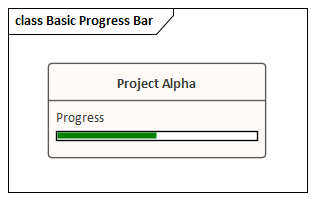
This illustration shows an example of a default progress bar:
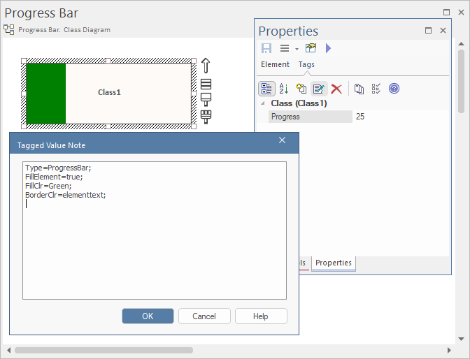
Creating a Progress Bar using a new Tagged Value
Follow the steps below to display a progress bar within an element, using a simple Tagged Value.
Step |
Action |
See also |
|---|---|---|
|
1 |
On a diagram, create an element that can display compartments (such as a Requirement or Feature) and add a simple Tagged Value to it. |
Quick Start - Add Tagged Value To Elements |
|
2 |
From the 'Tags' tab of the Properties window open the tag's notes and add 'Type=ProgressBar;' (including the semi-colon) and then click on the .  (You can add further options to the Tagged Value, as described in the Additional Progress Bar Options table.) |
|
|
3 |
Click on the element and either press or right-click and select the 'Compartment Visibility' option. The 'Compartment Visibility' dialog displays. |
|
|
4 |
Select the 'Tags' checkbox in the 'Show Element Compartments' panel, then click on the . The progress bar will now display on the element on the diagram, with the Tagged Value name above the bar. |
|
|
5 |
In the 'Tags' tab of the Properties window, indicate progress by typing a number between 1 and 100 into the 'Value' field for the tag. On the diagram, the appropriate length of the progress bar is filled in green. |
Creating a Progress Bar from the 'UML Types' dialog
You can also define a progress bar Tagged Value from the 'UML Types' dialog that can then be applied to any element, without having to set the Tagged Value notes each time.
Step |
Action |
See also |
|---|---|---|
|
1 |
Select the 'Settings > Reference Data > UML Types' ribbon option to display the 'UML Types' dialog and click on the 'Tagged Value Types' tab. |
Tagged Value Types |
|
2 |
In the 'Tag Name' and 'Description' fields, type a name and description for the Tagged Value. In the 'Detail' field type the option parameters and their values for the Tagged Value. Click on the and on the .  (The option parameters are described in the Additional Progress Bar Options table.) |
|
|
3 |
Select the 'Start > Application > Design > Properties' ribbon option to open the Properties window (if it is not already open) and select the 'Tags' tab. On a diagram select an element, then on the 'Tags' tab click on the In the 'Tag' field of the Tagged Value dialog, click on the drop-down arrow and select the Tagged Value you created in step 2, then click on the . |
|
|
4 |
On the diagram, right-click on the element and select the 'Compartment Visibility' option to display the 'Compartment Visibility' dialog. |
|
|
5 |
Select the 'Tags' checkbox and click on the . |
|
|
6 |
On the 'Tags' tab, change the number in the value field a few times, clicking off the field each time. Notice the effect this has on the progress bar. |
 (New Tagged Value) button.
 Creating a Progress Bar using the Custom Drawn Element
Custom-drawn elements allow the use of the element's fill color to represent the progress in the progress bar, so the element itself becomes the progress bar.
To display progress using the element's fill color as the progress bar, setup a Tagged Value for the progress bar as described in the previous sections, then add the following line to the Tagged Value's Notes: FillElement =true; You will also need to set the Diagram property "Appearance > Custom Style", by placing a check against that property.
You can set the fill color, background color and border color, by adding further parameters to the Notes of the Tagged Value.
For example:
- FillClr=val;
- BackClr=val;
- BorderClr=val;
When setting the colours of a progress bar, 'val' can be supplied in a variety of ways, such as:
- RGB(0,128,0);
- HSL(300, 50,86);
- #00FF00;
Default web colour names such as AliceBlue, Green or Khaki can also be used. Additionally, it is possible to use the current fill, line, or text color of the element for the properties mentioned above by using ‘elementfill’, ‘elementborder’, or ‘elementtext’.
For example:
- FillClr=elementfill;
- BorderClr=elementtext;
Examples of Setting Colors When Displaying Progress Using Element Fill Color
Example |
Tagged Value Note |
|---|---|
|
Using Hex Values 
|
Type=ProgressBar; FillElement=true; FillClr=#2F4550; BorderClr=#629677; BackClr=#586F7C; |
|
Using HSL, RGB and Default HTML Colors 
|
Type=ProgressBar; FillElement=true; FillClr=hsl(210,100,97); BorderClr=RGB(23,12,202); BackClr=LightSeaGreen; |
|
Using RGB and Current Element Fill and Border colors 
|
Type=ProgressBar; FillElement=true; FillClr=rgb(230,214,239); BorderClr=elementline; BackClr=elementfill; |
|
Using the current element fill 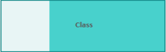
|
Type=ProgressBar; FillElement=true; FillClr=elementfill:s=-30:l=70:; BorderClr=elementline; BackClr=elementfill;
|
Additional Progress Bar Options
A default progress bar will show the Tagged Value name and reflect values in the range 0-100. You can change the range values if required, and display text to the right of the bar if more information has to be provided. The background, border and fill colors of the progress bar are, by default, determined by the currently-applied inbuilt diagram theme. However, you can apply your own colors to one of more of these properties.
Add these parameters to the Notes field of the Tagged Value, to enhance the progress bar.
Parameter |
Description |
See also |
|---|---|---|
|
MinVal |
Use the MinVal option to set the lowest allowed value to be represented on the progress bar.
A progress bar with the setting MinVal=10; will start at 10. Values lower than 10 will not be shown on it. If a maximum value (MaxVal) has been defined, the progress bar will show any values between MinVal and MaxVal (inclusive); otherwise, the maximum value will default to MinVal + 100. So, if MinVal=10, the progress bar can show values between 10 and 110 (inclusive). |
|
|
MaxVal |
Use the MaxVal option to set the highest allowed value to be represented on the progress bar.
A progress bar with the setting MaxVal=300; will show values up to and including 300. Values higher than 300 will not be shown. If a minimum value (MinVal) has been set, the progress bar will show any values between MinVal and MaxVal (inclusive); otherwise the minimum value will default to 0. So, if MaxVal=300 the progress bar can show values between 0 and 300 (inclusive). |
|
|
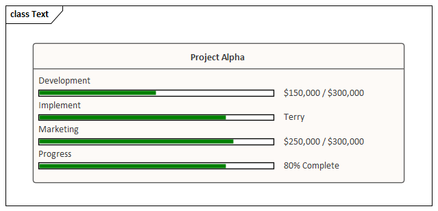
Text |
Use the Text option to define additional text to display on the right hand side of the progress bar. The text might be a resource name or the current take up of the total allowed budget of a project.
This illustration shows a number of examples of using the Text option.
|
|
|
Compartment |
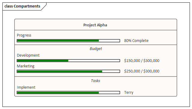
By default, progress bars in an element display together in a separate compartment from other types of Tagged Value (provided that the diagram and/or element is set to display tag compartments). When there are several progress bars on an element, each relating to a different factor of the project, it can become harder to distinguish between them. In these cases it is possible to set the progress bars to display in specific compartments in order to increase clarity. This also provides an additional level of labeling. So you might have an element relating to costs, and two or more compartments that indicate costs of different departments, where the department name is reflected in the compartment name. Or compartments that each contain two or more progress bars indicating, say, the costs and percentage completion of tasks in each department.
To add multiple progress bars to the same compartment simply give the progress bars the same compartment name. This example shows the element from the Text parameter example, but with the use of compartments to aid in readability.
|
|
|
BackClr |
Use the BackClr option to override the color used for the unfilled portion of the progress bar.
<color> can be one of a variety of values, such as the RGB value rgb(198,198,198) for a light gray color. See the Progress Bar Color Options table for a full list of available values when setting colors. |
|
|
FillClr |
Use the FillClr option to override the color used for the filled portion of the progress bar.
<color> can be one of a variety of options, such as the hex value #0000ff for a bright red. See the Progress Bar Color Options table for a full list of available values when setting colors. |
|
|
BorderClr |
Use the BorderClr option to override the color that is drawn around the edges of the progress bar.
<color> can be one of a variety of options, such as the keyword elementtext to select the same color as the current element's text color. See the Progress Bar Color Options table for a full list of available values when setting colors. |
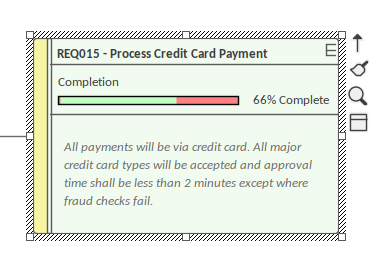
Example
The Requirement element 'REQ015 - Process Credit Card Payment' is given a Tagged Value named 'Completion', with a value of '66'.
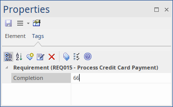
In the Tagged Values Notes, we specify 'Type=ProgressBar;' along with display text and color settings.
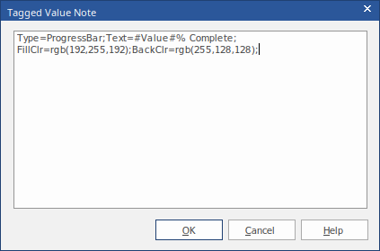
The result is the Progress Bar seen here:
Progress Bar Color Options
This table lists the different types of value that can be used with the options BackClr, FillClr and BorderClr when setting custom colors for a progress bar.
Value |
Description |
See also |
|---|---|---|
|
rgb(red,green,blue) |
Using rgb values you can set the red, green and blue color components to create the color you require. Example: BackClr=rgb(46, 139, 87); //Sets the unfilled portion of the progress bar to a sea green color.
This option can be useful in conjunction with the color pickers from the 'Layout' tab as they give an RGB value for the currently selected color. |
|
|
hsl(hue, saturation, luminosity) |
Using hsl is very similar to using rgb. Unlike rgb, however, it is easier to create a lighter or darker version of the same color by simply adjusting the luminosity, or to increase or decrease the intensity of the color by adjusting the saturation. Example: FillClr=hsl(197, 71, 73); //Sets the filled portion of the progress bar to a sky blue color.
|
|
|
Hex Values |
Colors can also be defined using a hex value. Example: BorderClr:#000000; //Sets the border color of the progress bar to black.
|
|
|
HTML Color Names |
It is also possible to use the standard web color names when defining a color for progress bars. Example: fillclr=aliceblue; //Sets the filled portion of the progress bar to the standard color 'aliceblue'
|
|
|
Element Colors |
Using ElementFill, ElementLine or ElementText will set the color value to the fill, line or text color of the currently-selected element (that is, ElementFill will apply the element's current fill color). Colors set this way can be further refined by using the modifiers s=<value> and l=<value> to modify the color's saturation and luminosity, making the color assigned to the progress bar a slightly altered version of the currently selected element color. These settings can be useful if the element is expected to change color (such as from the use of a Diagram Legend) to keep the progress bars themed correctly with the element. Example: backclr=elementfill:s=-10:l=20:; //Sets the unfilled portion of the progress bar to be the same as the element's fill color but with a 10% decrease in the color's saturation and a 20% increase in the luminosity.
|
Diagram Legends |
|
none |
The none keyword is used to indicate that no color should be applied to the selected field. Example: borderClr=none; //Removes the border from the progress bar. |
Progress Bars with MDG Technologies
Progress bars can also be created within MDG Technologies to define a consistent set of progress bars for use with multiple projects.